Bokeh快速入门
绘图步骤:
- 准备数据
- 选择结果输出方式
可以用output_file()输出为"lines.html". 也可以使用output_notebook()在 Jupyter notebooks中直接展示。
-
用
figure()绘制画布 - 绘制图形,如line()
- 显示绘图结果
举个栗子:
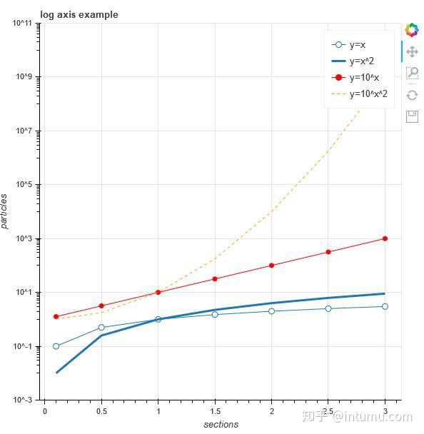
01_显示多条曲线,用用output_file()展示:
from bokeh.plotting import figure, output_file, show

# 准备数据
x = [0.1, 0.5, 1.0, 1.5, 2.0, 2.5, 3.0]
y0 = [i**2 for i in x]
y1 = [10**i for i in x]
y2 = [10**(i**2) for i in x]

# 输出为静态的html
output_file("log_lines.html")

# 创建画布
p = figure(
   tools="pan,box_zoom,reset,save",
   y_axis_type="log", y_range=[0.001, 10**11], title="log axis example",
   x_axis_label='sections', y_axis_label='particles'
)

# 添加曲线
p.line(x, x, legend="y=x")
p.circle(x, x, legend="y=x", fill_color="white", size=8)
p.line(x, y0, legend="y=x^2", line_width=3)
p.line(x, y1, legend="y=10^x", line_color="red")
p.circle(x, y1, legend="y=10^x", fill_color="red", line_color="red", size=6)
p.line(x, y2, legend="y=10^x^2", line_color="orange", line_dash="4 4")

# 显示结果
show(p)
PS:正因为Matplotlib的图太丑,参数设置复杂;Plotly需要注册才能使用更多功能;Seaborn对高版本Python支持不是很友好(本主在2016年放弃Seaborn,现在好很多了),且同ggplot2对Flask支持不是很友好,本主当时需要实现Flask数据可视化(如下,纯Flask与Bokeh交互)。
02_使用Jupyter notebooks展示结果:
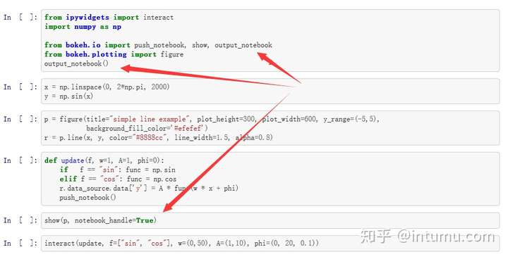
PS:该例子中的绘图数据直接更新的函数可以暂时不管它,比较高端的操作;也可以将绘图命令直接写成一个函数,后续直接调用。
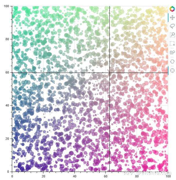
03_向量化的颜色和大小:
import numpy as np

from bokeh.plotting import figure, output_file, show

# 使用numpy产生一个随机序列(x,y坐标)
N = 4000
x = np.random.random(size=N) * 100
y = np.random.random(size=N) * 100
radii = np.random.random(size=N) * 1.5
colors = [
    "#%02x%02x%02x" % (int(r), int(g), 150) for r, g in zip(50+2*x, 30+2*y)
]

# 输出为静态的html
output_file("color_scatter.html", title="color_scatter.py example", mode="cdn")

TOOLS = "crosshair,pan,wheel_zoom,box_zoom,reset,box_select,lasso_select"

# 根据上面的工具配置生成一个画布
p = figure(tools=TOOLS, x_range=(0, 100), y_range=(0, 100))

# 根据上面的数据生成离散的圆
p.circle(x, y, radius=radii, fill_color=colors, fill_alpha=0.6, line_color=None)

# 显示结果
show(p)
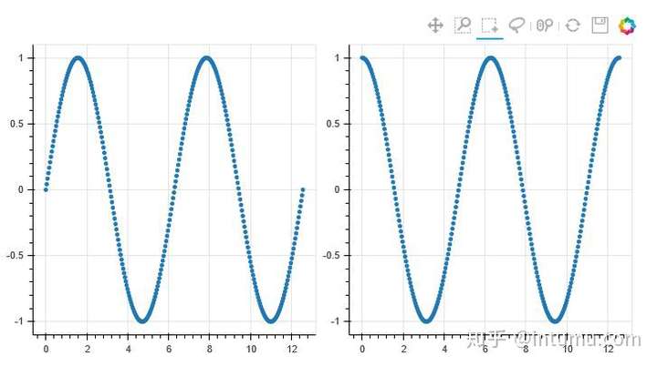
04_网格显示并通过数据链接同时移动数据:
import numpy as np

from bokeh.layouts import gridplot
from bokeh.plotting import figure, output_file, show

# prepare some data
N = 100
x = np.linspace(0, 4*np.pi, N)
y0 = np.sin(x)
y1 = np.cos(x)
y2 = np.sin(x) + np.cos(x)

# output to static HTML file
output_file("linked_panning.html")

# create a new plot
s1 = figure(width=250, plot_height=250, title=None)
s1.circle(x, y0, size=10, color="navy", alpha=0.5)

# NEW: create a new plot and share both ranges
# 新:图2的x,y轴范围与图1链接(移动时,x,y同时移动)
s2 = figure(width=250, height=250, x_range=s1.x_range, y_range=s1.y_range, title=None)
s2.triangle(x, y1, size=10, color="firebrick", alpha=0.5)

# 新:图3仅x轴范围与图1链接(移动时,仅x轴同时移动)
s3 = figure(width=250, height=250, x_range=s1.x_range, title=None)
s3.square(x, y2, size=10, color="olive", alpha=0.5)

# 新:网格显示3张图,并不显示工具栏
p = gridplot([[s1, s2, s3]], toolbar_location=None)

# show the results
show(p)
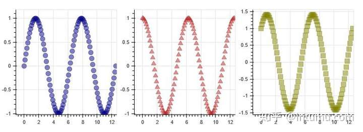
PS:动态效果请参照页底英文文档。
05_网格显示并通过选框同时选定特定数据:
import numpy as np
from bokeh.plotting import *
from bokeh.models import ColumnDataSource

# prepare some date
N = 300
x = np.linspace(0, 4*np.pi, N)
y0 = np.sin(x)
y1 = np.cos(x)

# output to static HTML file
output_file("linked_brushing.html")

# NEW: create a column data source for the plots to share
# 新:Bokeh自定义的数据格式ColumnDataSource
source = ColumnDataSource(data=dict(x=x, y0=y0, y1=y1))

# 在工具栏中增加了box_select,lasso_select,矩形选框和套索选框
TOOLS = "pan,wheel_zoom,box_zoom,reset,save,box_select,lasso_select"

# create a new plot and add a renderer
left = figure(tools=TOOLS, width=350, height=350, title=None)
# 这里直接用source定义数据源(ColumnDataSource类似于Pandas矩阵,'x', 'y0'为列名称)
left.circle('x', 'y0', source=source)

# create another new plot and add a renderer
right = figure(tools=TOOLS, width=350, height=350, title=None)
# 这里直接用source定义数据源(ColumnDataSource类似于Pandas矩阵,'x', 'y1'为列名称)
right.circle('x', 'y1', source=source)

# 网格显示图1、图2
p = gridplot([[left, right]])

# 显示结果
show(p)
PS:动态效果请参照页底英文文档。
06_时间序列显示:
import numpy as np

from bokeh.plotting import figure, output_file, show
from bokeh.sampledata.stocks import AAPL

# prepare some data
aapl = np.array(AAPL['adj_close'])
aapl_dates = np.array(AAPL['date'], dtype=np.datetime64)

window_size = 30
window = np.ones(window_size)/float(window_size)
aapl_avg = np.convolve(aapl, window, 'same')

# output to static HTML file
output_file("stocks.html", title="stocks.py example")

# create a new plot with a a datetime axis type
# 注:这里x_axis_type="datetime",Bokeh早期版本直接支持pandas的时间序列;还有就是时间格式对中文不友好
p = figure(plot_width=800, plot_height=350, x_axis_type="datetime")

# add renderers
p.circle(aapl_dates, aapl, size=4, color='darkgrey', alpha=0.2, legend='close')
p.line(aapl_dates, aapl_avg, color='navy', legend='avg')

# NEW: customize by setting attributes
# 新:关于画布的一些个性化定义
p.title.text = "AAPL One-Month Average"
p.legend.location = "top_left"
p.grid.grid_line_alpha = 0
p.xaxis.axis_label = 'Date'
p.yaxis.axis_label = 'Price'
p.ygrid.band_fill_color = "olive"
p.ygrid.band_fill_alpha = 0.1

# show the results
# 显示结果
show(p)
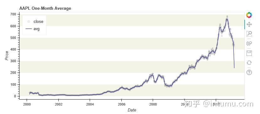
PS:当初选择学习Bokeh的原因:在0.12.3版本中有Chart高级图表类(time等),采用Pandas中的Resample处理时间序列,然用Flask展示结果。但在之后某个版本竟取消了,取而代之以基本图元来生成复杂图形,大道至简,他们在做减法,不错~
07_Bokeh应用服务器:
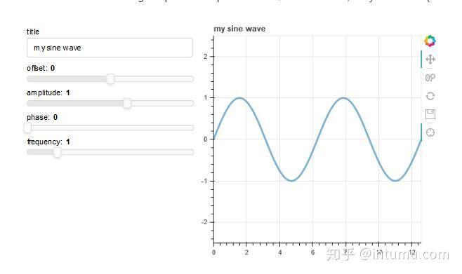
PS:直接生成web应用。如果自行开发数据座舱,如其与Flask进行交互,及采用其他可视化工具(腾讯API地理位置信息热力图,百度echart骚包图表等)。嗯,Pyechart可以看看,建议读者自行生成echart页面,并将其模块化。