一个有用的Python可视化库yellowbrick-Feature Analysis
背景介绍
从学sklearn时,除了算法的坎要过,还得学习matplotlib可视化,对我的实践应用而言,可视化更重要一些,然而matplotlib的易用性和美观性确实不敢恭维。陆续使用过plotly、seaborn,最终定格在了Bokeh,因为它可以与Flask完美的结合,数据看板的开发难度降低了很多。
前阵子看到这个库可以较为便捷的实现数据探索,今天得空打算学习一下。原本访问的是英文文档,结果发现已经有人在做汉化,虽然看起来也像是谷歌翻译的,本着拿来主义,少费点精力的精神,就半抄半学,还是发现了一些与文档不太一致的地方。
加载数据集
# 加载数据集
import os
import pandas as pd
FIXTURES  = os.path.join(os.getcwd(), "data")
datasets = {
    "bikeshare": os.path.join(FIXTURES, "bikeshare", "bikeshare.csv"),
    "concrete": os.path.join(FIXTURES, "concrete", "concrete.csv"),
    "credit": os.path.join(FIXTURES, "credit", "credit.csv"),
    "energy": os.path.join(FIXTURES, "energy", "energy.csv"),
    "game": os.path.join(FIXTURES, "game", "game.csv"),
    "mushroom": os.path.join(FIXTURES, "mushroom", "mushroom.csv"),
    "occupancy": os.path.join(FIXTURES, "occupancy", "occupancy.csv"),
    "spam": os.path.join(FIXTURES, "spam", "spam.csv"),
}

def load_data(name, download=True):
    """
    Loads and wrangles the passed in dataset by name.
    If download is specified, this method will download any missing files.
    """

    # Get the path from the datasets
    path = datasets[name]

    # Check if the data exists, otherwise download or raise
    if not os.path.exists(path):
        if download:
            download_all()
        else:
            raise ValueError((
                "'{}' dataset has not been downloaded, "
                "use the download.py module to fetch datasets"
            ).format(name))


    # Return the data frame
    return pd.read_csv(path)
特征分析
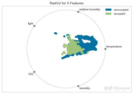
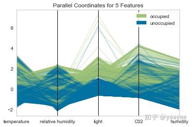
RadViz Visualizer
雷达图
对于回归,RadViz可视化工具应该使用颜色序列来显示目标信息,而不是离散颜色。
# 房屋出租率
data = load_data("occupancy")
# 选取训练集与目标集
features = ["temperature", "relative humidity", "light", "C02", "humidity"]
classes = ["unoccupied", "occupied"]
# 选取数据
X = data[features]
y = data.occupancy
data.head()
datetime temperature relative humidity light C02 humidity occupancy 0 2015-02-04 17:51:00 23.18 27.2720 426.0 721.25 0.004793 1 1 2015-02-04 17:51:59 23.15 27.2675 429.5 714.00 0.004783 1 2 2015-02-04 17:53:00 23.15 27.2450 426.0 713.50 0.004779 1 3 2015-02-04 17:54:00 23.15 27.2000 426.0 708.25 0.004772 1 4 2015-02-04 17:55:00 23.10 27.2000 426.0 704.50 0.004757 1
# 加载库
from yellowbrick.features import RadViz
# 可视化
visualizer = RadViz(classes=classes, features=features)
# 直观展示特征重要性
visualizer.fit(X, y)      # Fit the data to the visualizer
visualizer.transform(X)   # Transform the data
visualizer.poof()         # Draw/show/poof the data
Rank Features
# 加载数据集
data = load_data('credit')

# 选取特征
features = [
        'limit', 'sex', 'edu', 'married', 'age', 'apr_delay', 'may_delay',
        'jun_delay', 'jul_delay', 'aug_delay', 'sep_delay', 'apr_bill', 'may_bill',
        'jun_bill', 'jul_bill', 'aug_bill', 'sep_bill', 'apr_pay', 'may_pay', 'jun_pay',
        'jul_pay', 'aug_pay', 'sep_pay',
    ]

# 选取数据
X = data[features]
y = data.default
Rank 1D
1维显示
from yellowbrick.features import Rank1D
# 可视化
visualizer = Rank1D(features=features, algorithm='shapiro')
visualizer.fit(X.values, y)                # Fit the data to the visualizer
visualizer.transform(X)             # Transform the data
visualizer.poof()                   # Draw/show/poof the data
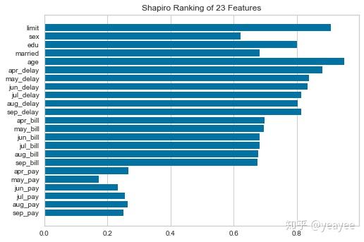
?Rank1DRank 2D
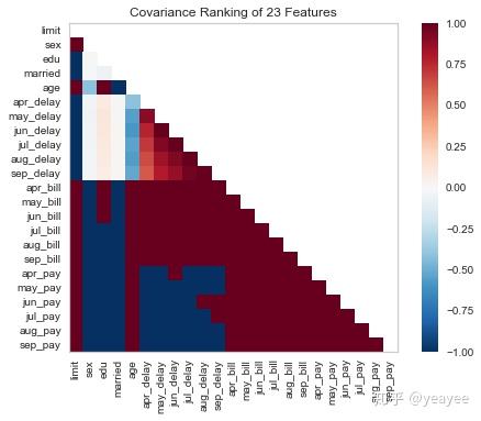
2维显示
from yellowbrick.features import Rank2D

# 可视化
visualizer = Rank2D(features=features, algorithm='covariance')

visualizer.fit(X, y)                # Fit the data to the visualizer
visualizer.transform(X)             # Transform the data
visualizer.poof()                   # Draw/show/poof the data
# 可视化
visualizer = Rank2D(features=features, algorithm='pearson')

visualizer.fit(X, y)                # Fit the data to the visualizer
visualizer.transform(X)             # Transform the data
visualizer.poof()                   # Draw/show/poof the data
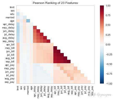
?Rank2D
# algorithm :{'pearson', 'covariance', 'spearman'}
Parallel Coordinates
堆叠图
# Load the classification data set
data = load_data("occupancy")

# Specify the features of interest and the classes of the target
features = [
    "temperature", "relative humidity", "light", "C02", "humidity"
]
classes = ["unoccupied", "occupied"]

# Extract the instances and target
X = data[features]
y = data.occupancy
data.head()
datetime temperature relative humidity light C02 humidity occupancy 0 2015-02-04 17:51:00 23.18 27.2720 426.0 721.25 0.004793 1 1 2015-02-04 17:51:59 23.15 27.2675 429.5 714.00 0.004783 1 2 2015-02-04 17:53:00 23.15 27.2450 426.0 713.50 0.004779 1 3 2015-02-04 17:54:00 23.15 27.2000 426.0 708.25 0.004772 1 4 2015-02-04 17:55:00 23.10 27.2000 426.0 704.50 0.004757 1
from yellowbrick.features import ParallelCoordinates

# Instantiate the visualizer
visualizer = ParallelCoordinates(
    classes=classes, features=features, sample=0.5, shuffle=True
)

# Fit and transform the data to the visualizer
visualizer.fit_transform(X, y)

# Finalize the title and axes then display the visualization
visualizer.poof()
<Figure size 800x550 with 1 Axes>
visualizer.fit_transform(X, y)
visualizer.poof()
from yellowbrick.features import ParallelCoordinates

# Instantiate the visualizer
visualizer = ParallelCoordinates(
    classes=classes, features=features,
    normalize='standard', sample=0.2, shuffle=True,
)

# Fit the visualizer and display it
visualizer.fit_transform(X, y)
visualizer.poof()
from yellowbrick.features import ParallelCoordinates

# Instantiate the visualizer
visualizer = ParallelCoordinates(
    classes=classes, features=features,
    normalize='standard', sample=0.2, shuffle=True,fast=True
)

# Fit the visualizer and display it
visualizer.fit_transform(X, y)
visualizer.poof()

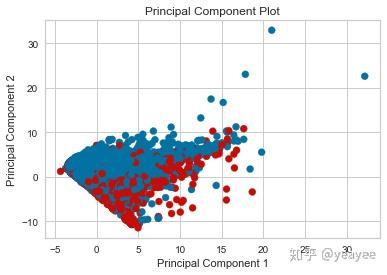
PCA Projection
PCA投影
import numpy as np
# Load the classification data set
data = load_data('credit')

# Specify the features of interest and the target
target = "default"
features = [col for col in data.columns if col != target]

# Extract the instance data and the target
X = data[features]
y = data[target]

# Create a list of colors to assign to points in the plot
colors = np.array(['r' if yi else 'b' for yi in y])
from yellowbrick.features.pca import PCADecomposition

visualizer = PCADecomposition(scale=True, color=colors)
visualizer.fit_transform(X, y)
visualizer.poof()
E:\Anaconda3\lib\site-packages\sklearn\preprocessing\data.py:625: DataConversionWarning: Data with input dtype int64 were all converted to float64 by StandardScaler.
  return self.partial_fit(X, y)
E:\Anaconda3\lib\site-packages\sklearn\base.py:462: DataConversionWarning: Data with input dtype int64 were all converted to float64 by StandardScaler.
  return self.fit(X, **fit_params).transform(X)
E:\Anaconda3\lib\site-packages\sklearn\pipeline.py:451: DataConversionWarning: Data with input dtype int64 were all converted to float64 by StandardScaler.
  Xt = transform.transform(Xt)
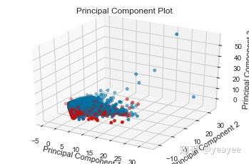
visualizer = PCADecomposition(scale=True, color=colors, proj_dim=3)
visualizer.fit_transform(X, y)
visualizer.poof()
E:\Anaconda3\lib\site-packages\sklearn\preprocessing\data.py:625: DataConversionWarning: Data with input dtype int64 were all converted to float64 by StandardScaler.
  return self.partial_fit(X, y)
E:\Anaconda3\lib\site-packages\sklearn\base.py:462: DataConversionWarning: Data with input dtype int64 were all converted to float64 by StandardScaler.
  return self.fit(X, **fit_params).transform(X)
E:\Anaconda3\lib\site-packages\sklearn\pipeline.py:451: DataConversionWarning: Data with input dtype int64 were all converted to float64 by StandardScaler.
  Xt = transform.transform(Xt)
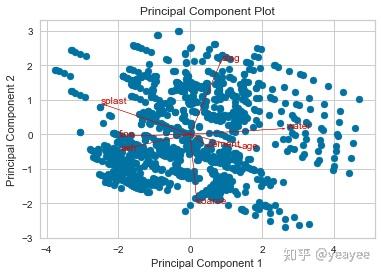
Biplot
双标图:横纵坐标是主成分,各个向量代表原特征。向量在主成分上的投影可以代表两者的相关程度。
1.双标图中的点,近似表示了行(样本)信息。
2.双标图中的向量,近似表示列(属性)信息。
3.点之间的距离,反映它们对应的样本之间的差异大小,两点相距较远,对应样本差异大;两点相距较近,对应样本差异小,存在相似性。
4.样本点在单个向量上的投影,与对应样本在属性向量上的差异量相关余弦值为负时,向量负相关,对应的两个属性互相抵制。
5.余弦值的绝对值大小反映两向量间的相关性大小,值越大表明两个向量对应的属性之间相关性越高。
6.当两个向量近似垂直时,两个属性之间相关性很弱,几乎互不影响。
# 混凝土强度
data = load_data('concrete')

# Specify the features of interest and the target
target = "strength"
features = [
    'cement', 'slag', 'ash', 'water', 'splast', 'coarse', 'fine', 'age'
]

# Extract the instance data and the target
X = data[features]
y = data[target]
visualizer = PCADecomposition(scale=True, proj_features=True)
visualizer.fit_transform(X, y)
visualizer.poof()
E:\Anaconda3\lib\site-packages\sklearn\preprocessing\data.py:625: DataConversionWarning: Data with input dtype int64, float64 were all converted to float64 by StandardScaler.
  return self.partial_fit(X, y)
E:\Anaconda3\lib\site-packages\sklearn\base.py:462: DataConversionWarning: Data with input dtype int64, float64 were all converted to float64 by StandardScaler.
  return self.fit(X, **fit_params).transform(X)
E:\Anaconda3\lib\site-packages\sklearn\pipeline.py:451: DataConversionWarning: Data with input dtype int64, float64 were all converted to float64 by StandardScaler.
  Xt = transform.transform(Xt)
visualizer = PCADecomposition(scale=True, proj_features=True, proj_dim=3)
visualizer.fit_transform(X, y)
visualizer.poof()
E:\Anaconda3\lib\site-packages\sklearn\preprocessing\data.py:625: DataConversionWarning: Data with input dtype int64, float64 were all converted to float64 by StandardScaler.
  return self.partial_fit(X, y)
E:\Anaconda3\lib\site-packages\sklearn\base.py:462: DataConversionWarning: Data with input dtype int64, float64 were all converted to float64 by StandardScaler.
  return self.fit(X, **fit_params).transform(X)
E:\Anaconda3\lib\site-packages\sklearn\pipeline.py:451: DataConversionWarning: Data with input dtype int64, float64 were all converted to float64 by StandardScaler.
  Xt = transform.transform(Xt)
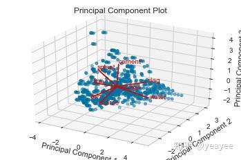
# 粗、细两个特征向量是垂直的Feature Importances
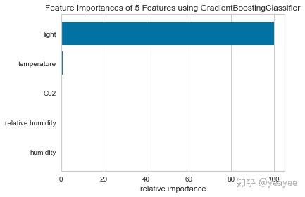
特征重要程度
# 租房
data = load_data("occupancy")

# Specify the features of interest
features = [
    "temperature", "relative humidity", "light", "C02", "humidity"
]

# Extract the instances and target
X = data[features]
y = data.occupancy
import matplotlib.pyplot as plt

from sklearn.ensemble import GradientBoostingClassifier

from yellowbrick.features.importances import FeatureImportances

# Create a new matplotlib figure
fig = plt.figure()
ax = fig.add_subplot()

viz = FeatureImportances(GradientBoostingClassifier(), ax=ax)
viz.fit(X, y)
viz.poof()
# 混凝土
data = load_data("concrete")

# Specify the features of interest
features = [
    "cement","slag","ash","water","splast","coarse","fine","age"
]

# Extract the instances and target
X = data[features]
y = data.strength
import matplotlib.pyplot as plt

from sklearn.linear_model import Lasso

from yellowbrick.features.importances import FeatureImportances

# Create a new figure
fig = plt.figure()
ax = fig.add_subplot()

# Title case the feature for better display and create the visualizer
labels = list(map(lambda s: s.title(), features))
viz = FeatureImportances(Lasso(), ax=ax, labels=labels, relative=False)

# Fit and show the feature importances
viz.fit(X, y)
viz.poof()
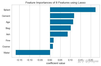
# 混凝土强度和水是负相关的Recursive Feature Elimination(RFE)
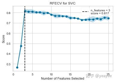
递归特征消除
from sklearn.svm import SVC
from sklearn.datasets import make_classification

from yellowbrick.features import RFECV

# Create a dataset with only 3 informative features
X, y = make_classification(
    n_samples=1000, n_features=25, n_informative=3, n_redundant=2,
    n_repeated=0, n_classes=8, n_clusters_per_class=1, random_state=0
)

# Create RFECV visualizer with linear SVM classifier
viz = RFECV(SVC(kernel='linear', C=1))
viz.fit(X, y)
viz.poof()
import warnings
warnings.filterwarnings("ignore", category=FutureWarning, module="sklearn")  # 忽略警告
from sklearn.ensemble import RandomForestClassifier
from sklearn.model_selection import StratifiedKFold

data = load_data('credit')

# target = df['default']
features = [col for col in data.columns if col != 'default']

X = data[features]
y = data['default']

cv = StratifiedKFold(5)  # 5折还真慢
oz = RFECV(RandomForestClassifier(), cv=cv, scoring='f1_weighted')

oz.fit(X, y)
oz.poof()
---------------------------------------------------------------------------

KeyboardInterrupt                         Traceback (most recent call last)


KeyboardInterrupt:
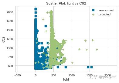
Scatter Plot Visualizer
# Load the classification data set
data = load_data("occupancy")

# Specify the features of interest and the classes of the target
features = ["temperature", "relative humidity", "light", "C02", "humidity"]
classes = ["unoccupied", "occupied"]

# Extract the numpy arrays from the data frame
X = data[features]
y = data.occupancy
from yellowbrick.contrib.scatter import ScatterVisualizer

visualizer = ScatterVisualizer(x="light", y="C02", classes=classes)

visualizer.fit(X, y)
visualizer.transform(X)
visualizer.poof()
E:\Anaconda3\lib\site-packages\yellowbrick\contrib\scatter.py:225: FutureWarning: Method .as_matrix will be removed in a future version. Use .values instead.
  X_two_cols = X[self.features_].as_matrix()
Joint Plot Visualization
复合图
# Load the data
df = load_data("concrete")
feature = "cement"
target = "strength"

# Get the X and y data from the DataFrame
X = df[feature]
y = df[target]
from yellowbrick.features import JointPlotVisualizer

visualizer = JointPlotVisualizer(feature=feature, target=target)

visualizer.fit(X, y)
visualizer.poof()
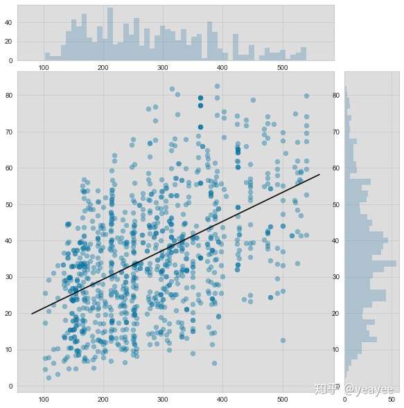
# 水泥用量与强度之间的关系